Reading a US Satellite and Radar Map: What the Layers Show and How to Use the Extended Forecast
Weather maps are often treated like background noise—something you glance at while deciding whether to grab an umbrella. But a well-designed satellite and radar view can do more than confirm what you already see outside your window. It can show where clouds are thickening, where the atmosphere is drying out, and where rain or snow is actively falling. Used alongside an extended forecast, these tools help translate a fast-changing atmosphere into practical decisions for the day ahead.
This article explains the most common layers found on a US satellite and radar map and how to interpret them in a way that supports everyday planning. The focus is on three widely used views: current cloud cover, mid-level atmospheric moisture (often displayed as a water vapor-style layer), and precipitation radar that distinguishes rain and snow. It also outlines how to pair these real-time layers with the forecast information typically available in a “weather details” section for the days ahead.
Why satellite and radar matter for day-to-day planning
A forecast is a prediction; a satellite or radar map is a snapshot. Each is useful on its own, but the combination is where most people gain confidence. If the forecast suggests worsening conditions later, the map can help you see whether those conditions are already developing upstream. If the forecast calls for clearing skies, satellite imagery can show whether clouds are thinning or whether a stubborn deck of gray is still holding in place.
Many map interfaces encourage users to “follow along” with the latest weather being monitored, the threats it may bring, and the extended forecast each day. That framing is important: maps are not just visuals for curiosity. They are tools for preparedness—especially when you use them to understand timing, movement, and the difference between a cloudy day and an active storm day.
Layer 1: Current cloud cover—what you’re actually seeing
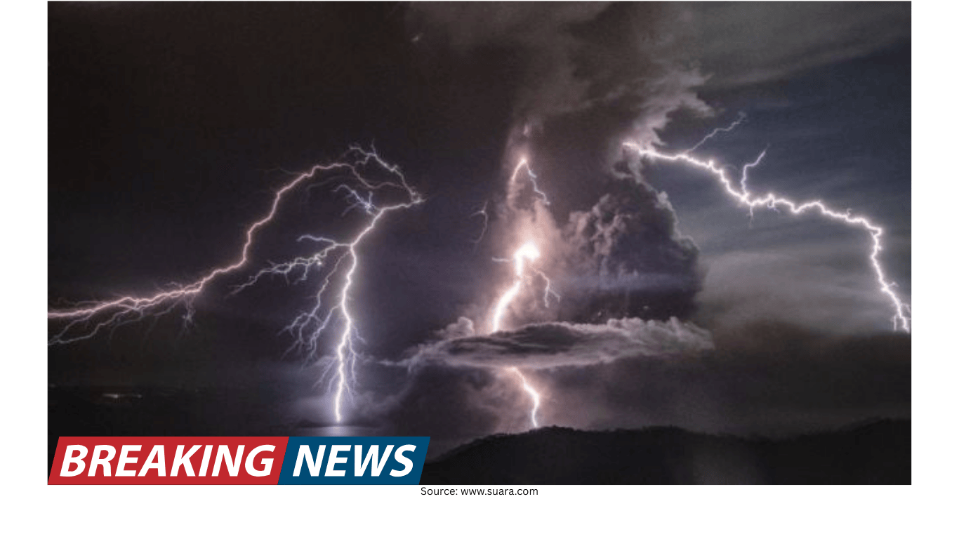
A basic US satellite layer often starts with cloud cover. In many displays, white and gray areas represent clouds. This is the most intuitive layer because it resembles what you might see from an airplane window: a broad blanket of cloudiness, scattered patches, or clear gaps.
Cloud cover maps are useful for answering simple but important questions:
- Is the sky clearing or filling in?
- Are clouds concentrated in one region or spread across multiple states?
- Is there a thick, uniform cloud shield that could signal a larger weather system?
On some satellite views, a “colder scale” is referenced in the context of heavier rain and snow. The key idea is that the visualization may use a temperature-like color scale to indicate cloud-top characteristics, where colder values can be associated with more intense weather processes. Even if you do not memorize the exact color legend, the practical takeaway is that not all cloud fields are equal. A thin veil of clouds is different from a deep, towering cloud mass that can be associated with heavier precipitation.
When you are using cloud cover to plan, pay attention to the edges. The boundary between cloudy and clear areas often tells you where conditions are changing. If that boundary is moving toward your location, you can anticipate a shift in sky conditions even before the forecast hour arrives.
Layer 2: Atmospheric moisture at mid-levels—dry vs. moist air
Cloud cover shows what is visible; a mid-level moisture layer offers clues about what may develop. Many map products include a view described as “areas of moist and dry air at mid-levels of the atmosphere,” with the driest air sometimes shown in red.
This type of layer is especially helpful for understanding transitions:
- Dry air intrusions: When a dry region pushes into a moist region, it can change how clouds behave and how precipitation evolves.
- Moisture corridors: Bands of moisture can align with storm tracks, supporting cloud development and precipitation.
- Clearing potential: Expanding dry air can be a sign that clouds may thin or break, depending on other conditions.
Because the driest air may be highlighted in red, it can be tempting to interpret red as “danger.” In this context, it is simply an indicator of dryness at a particular atmospheric level. The value for everyday users is comparative: you can see where the atmosphere is more moisture-rich versus where it is drying out, and then compare that pattern to the forecast narrative for your area.
Layer 3: Radar for rain and snow—tracking active precipitation
Radar is the layer most people associate with immediate impacts. While satellite can show cloud patterns, radar is designed to show where precipitation is occurring. Some map views call out specific regional snapshots, such as “current rain and snow in the Northeast US.”
When radar indicates rain and snow, it helps answer impact-driven questions:
- Is precipitation already falling, or is it still approaching?
- Is the affected area expanding or shrinking?
- Are there multiple bands of precipitation, suggesting more than one round?
If the map includes both rain and snow, the distinction matters for travel and outdoor plans. Even without adding new technical claims, it is fair to say that the practical consequences differ: rain can reduce visibility and create slick roads, while snow can create more disruptive conditions depending on intensity and timing. Radar offers a way to see where those precipitation types are currently reported on the map layer.
How to combine map layers with the extended forecast
Many weather interfaces encourage users to check the forecast for the days ahead in a “weather details” tab. The most effective approach is to treat the extended forecast as your plan and the map layers as your real-time verification.
Here is a simple routine that works whether you are planning a commute, a weekend outing, or a workday schedule:
- Start with the extended forecast: Identify the key windows—morning, afternoon, evening—when conditions are expected to change.
- Check cloud cover: Confirm whether cloudiness is building or clearing in the direction your area typically receives weather from.
- Review mid-level moisture: Look for nearby dry or moist regions that may support clearing or continued cloud development.
- Use radar last for immediate impact: If precipitation is in the forecast, radar shows whether it is already underway and how it is moving.
This sequence keeps the map from overwhelming you. Instead of staring at colors and textures without context, you are asking targeted questions that relate directly to your plans.
Interpreting map language: “threats it may bring”
Weather coverage often includes the phrase “the threats it may bring.” In practice, that means paying attention to what the active weather could change for you: whether conditions are deteriorating, whether precipitation is spreading, or whether cloud cover is thickening in a way that suggests a shift from a calm period to a more unsettled one.
Satellite and radar maps support this kind of awareness by showing:
- Scale: How large the cloud or precipitation area is.
- Location: Which regions are currently affected.
- Evolution: Whether features are intensifying, weakening, or reorganizing.
Even if you do not have a meteorology background, you can still use these cues to decide when to leave earlier, when to move outdoor tasks to a different hour, or when to monitor updates more closely.
A real-world reminder: winter conditions can change quickly
Maps are not only about convenience; they can also be about safety. One recent example described five stranded hikers rescued from a snowy mountainside near Big Bear Lake in California. The hikers were prepared for winter conditions but were unable to continue when their vehicles failed as conditions evolved. They were safely airlifted by Air Rescue 308, with no injuries reported, and later returned for their vehicles when the weather subsided.
The details of that incident underline a broader point that applies to anyone traveling or recreating outdoors: conditions can evolve, and the difference between “prepared” and “stuck” can come down to timing and changing weather. Satellite and radar layers, paired with the forecast for the days ahead, are among the tools people use to stay aware of what is happening now and what may develop next.
Accuracy claims and what they mean for users
Some weather services emphasize forecast performance, including statements that they are the world’s most accurate forecaster according to an accuracy overview covering 2021–2024, commissioned by a weather company and attributed to ForecastWatch. For readers, the practical takeaway is not to treat any single tool as infallible, but to recognize that forecast accuracy is measured and tracked, and that the best user experience typically comes from combining forecasts with real-time map observations.
In other words: use the forecast to plan, and use satellite and radar to confirm whether the atmosphere is behaving as expected.
Data and privacy notes users should be aware of
Modern weather platforms rely on data and technology, and they may use or share user data with data vendors. Many services also provide options that allow users to take control of their data through privacy settings and related tools.
If you use weather maps frequently—especially through apps or personalized dashboards—it is worth taking a moment to review privacy controls. Understanding what is collected and how preferences are stored can help you manage the balance between convenience (like saved locations) and personal data choices.
Quick reference: what each layer is best for
- Cloud cover: Best for understanding current sky conditions and broad system structure; white and gray areas typically represent clouds.
- Mid-level moisture (dry vs. moist air): Best for spotting atmospheric changes; driest air may be shown in red.
- Radar (rain and snow): Best for immediate impacts and tracking active precipitation, including regional views such as current rain and snow in the Northeast US.
Using the maps with confidence
You do not need to decode every color gradient to benefit from satellite and radar. Start with one question—“Is precipitation already near me?”—and use the radar layer. Or begin with, “Is the cloud shield expanding?” and use the cloud cover view. Over time, patterns become familiar, and the map becomes less like a complex graphic and more like a practical dashboard.
The most important habit is consistency: check the extended forecast, then check the map layers for confirmation. When the two align, your confidence grows. When they diverge, you know to monitor updates and adjust plans. That is the everyday value of satellite and radar—turning weather from a surprise into something you can anticipate.